Learn Data Science and Analytics with AWS Quicksight
- 10.11.2022
- 15

Learn Data Science and Analytics with AWS Quicksight
Instructors: Harshit Srivastava
6 sections • 16 lectures • 1h 13m total length
Video: MP4 1280x720 44 KHz | English + Sub
Updated 6/2022 | Size: 470 MB
Learn to create Data Visualization charts and Prepare your dataset to find insights and trend
What you'll learn
You would be able to create various kinds of Visualization charts using AWS Quicksight
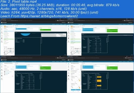
You could create charts such as Pie, Bar, Sankey, Treemap and Pivot table
You could visually find insights from the dataset and perform analysis to find useful information
You could also prepare your data before visualization by removing unwanted rows, columns and cells based on given conditions
You could create Filters and Calculated fields to perform data cleaning and preparation
Requirements
Before taking this course, if you are familiar with AWS (Amazon Web Services) cloud computing platform, it would be usefulBasic idea about data preparation such as with Excel or any BI editors
Description
In this course you would learn to create Visualization Charts and Data Preparation in AWS Quicksight. It is a powerful Business Intelligence tool that can be used perform a wide range of tasks such as-
Importing Dataset form multiple sources such as direct upload, S3 bucket, Redshift and other databases in multiple formats such as csv, xls and more.
Data Cleaning- by removing unwanted rows, columns or fields, from the dataset based on a given condition by using Filters and Excluded lists
Data Preparation- by adding custom columns or fields by either using a mathematical function or by customizing some existing fields using various function such as concat, ceil and much more
Changing Field type among String, Integer, Decimal, Country, State, Date, Time and other formats
Visualization Charts- by taking multiple fields and arranging them in Dimensions and Measures.
Analytics Dashboard- by creating various visualization charts and combining them on a single page to create a BI report or Analytics dashboard. It could be used to find insights from the dataset and identify trends, outliers and critical information
Conditional Formatting- by customizing the visual charts in terms of colors, data values, date range, value range and others
Homepage
Screenshots

~~~~ Welcome to my Blogs ~~~~
Do not forget to check it every day!
If You should find any files not found, please PM me
~Download Download: Best Software for All
~Tomorrowland2: Video Training
~Pluralsight Tutorials: All Pluralsight Videos
~EbookSA: Best Ebooks
~Graphic World: Best Graphics
Download from free file storage
Password: SAnet.ST
If you can't unrar with WinRAR, try 7Zip
RAPIDGATOR
NITROFLARE
Say Thank You